Sunday, September 11, 2011

{Freshly Made} # One!


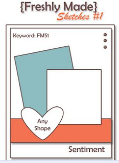
Have you seen this new blog yet? Well you better check it out here. My card pretty much follows the sketch with just a couple of changes, hope you like it. The challenge was to use this sketch and create a card with clean lines. This is my interpretaion.

I've been wanting to use fabric of some kind on a card for quite a while and thought this would be a good opportunity. I cut a small swatch of burlap and used it as one of the layers in the sketch and applied it to the card base. My image was also stamped onto the same color cs and mounted on top of a die cut frame of Early Espresso. I extended the frame in order to use the decorative bottom of the die. You may notice I notched my card on both sides of the front of the card in order to run the narrow ribbon around the card (I picked up this little tidbit from Papertrey Ink's blog). I thought it was a fresh approach to adding ribbon to cards and I think it's one I'll be using quite a bit. I chose to place my sentiment at the top of the card rather than the bottom as the sketch showed and place the shiny dots at the bottom rather than the top. It just seemed to work better for me.

Well that's it for now, hope you like my card, would love to hear from you.

Supplies used:
Stamps-SU Nature's Pace, Curly Cute
Inks-Old Olive, Elegant Eggplant
Die-Papertrey Ink's Half & Half
Ribbon-SU 1/8" Early Espresso
Misc. Natural Burlap fabric, spray adhesive

Paper Players Color Challenge # 63


This is the wonderful color challenge from Paper Players this week, really pretty colors.

As you can see I opted to use the colors for a Halloween card, seemed perfect to me.

My card base is basic Gray cs embossed using the spider web folder and then two smaller layers of DSP topped off with a strip of ribbon. The focal point of the card is two die cut labels in R.Razzelberry and W.White one a smidge larger than the other. The smaller W.White frame is stamped using basic gray ink. I added a sticker, yep a sticker! Don't ya just love this sticker, the bats were included, several more on a strip (a real find from a Dollar Store). I added the sentiment on the lower right hand corner to finish it off.

Here's my card...

It's difficult to see in the photo, but the two bats have shiny red eyes! Hope you like it.

Supplies used:
Paper-DSP Cast-A-Spell, basic gray CS
Ink-Basic Gray
Ribbon-Rich Razzelberry polka-dot
stamps-Teeny Tiny Wishes
Misc.-Martha Stewart Holiday Sticker
Dies-Papertrey Ink Mat Stack#1 and Mega Matstack #1

Monday, September 5, 2011

NEW LOOK!

Hey look at me, I've got a new look!

Many thanks to my daughter, Nance of Canopy Crafts, who surprised me with this wonderful new design. She assisted her friend and design team member from Paper Players, Lesley Croghan, coordinating all of the colors, embellishments, and fonts. You may know Lesley, she has recently started a new business here...designing custom and premade blogs. I think she has found her niche, don't you? Be sure to check it out and see what other bloggers have new looks, you may see something for yourself!

I really like the designer paper and the little bird embellishment. I especially like the center of the blog being white, which tends to showcase any postings. Now I better get to work and post some new cards.

Thanks for looking and feel free to leave a comment if you wish, happy blogging!

Friday, September 2, 2011

Cas-ual Fridays - #18


Woo hoo what a great idea from Cas-ual Fridays creating a clean and simple design using a book as inspiration!

The book I just finished reading is Nicholas Sparks' Safe Haven. I thought it sounded so much like the name of a boat, plus it takes place in South Carolina in and around boats in Southport. I'm really not a boater or fan of sailing, but this image is so serene and calming I thought it was perfect for this book.


The photo doesn't show the dazzling diamonds I touched to the waves around the boat. I also ripped out a definition of "safe" from an old dictionary for an added touch, the black cs is also embossed, but again hard to see in the picture.


Hope you like my project for this challenge, thanks for lookin', love to hear from you.


Unconventional Baby Colors-CCMC#165


Here's a color combo from Create with Connie & Mary that sings Halloween to me however, I chose to use the colors for an unconventional baby card!

Do you think I have enough "dots" on this card? I absolutely had to buy this stamp set, just loved the way the baby "ellie" is hanging on to his momma and the itty-bitty heart at the end of momma's trunk, so cute!

Here's my card using the three challenge colors for both inks and paper.

I stamped the razzelberry cs with the same ink using polka-dots for the background and also to coordinate with the pumpkin pie dotted frame which I used the ticket corner punch on the top corners. I stamped the "ellie's" in razzelberry ink, then cut out two little circles from the pattern paper, cut off approx. 1/3" of the circle to represent their ears, glued only the end to allow the ears to flap!

I didn't have a circle punch smaller than the 1/2", which I needed for the baby "ellie" ear, so I used the eyes from the Owl Builder stamp which I thought was the perfect size, and it was!

I colored three white pearls using the razzelberry marker pen and added to the top of the framed piece as I thought it looked to plain (can you image..with all those dots...too plain)!

I chose to use the reverse side of the razzelberry polka-dot ribbon to calm down the dots a bit, taped it to the frame and separately hand tied a knot, since I never seem to be able to combine both with one piece of ribbon.

Hope you enjoy looking at my card as much as I enjoyed creating it, thanks for lookin'!

All supplies used are Stampin' Up

Card stock-Rich Razzelberry, Pumpkin Pie & Lucky Limeade
Pattern paper- Designer Series Pattern Stack-Brights
Stamp-Baby Steps
Ribbon-R.Razzelberry polka-dot twill
Punch-Scallop, 1/2" circle punch & Owl Builder, ticket corner
Pearls (colored with R.Razzelberry marker pen