Saturday, December 31, 2011

Sympathy card

It's been a while since I've posted and unfortunately it has to be a sympathy card for a fellow scrapper/golfer friend's Mother-in-Law who recently passed away. These times are always sad, but seem even more so when they occur during the holidays.

I opted to create a very simple card using what I thought were calming colors. The background was created by stamping onto a piece of whisper white card stock using a three-step stamp (although it doesn't have to be used as such, can be used individually). I cut off two rows of the stamping and adhered to the top and bottom of the card front leaving enough room for the sentiment and that was it. I'm happy with the end results...what do you think, would love to hear from you.


Supplies:
Papertrey Ink Stamps Background stamp-"Rosie Posie" ; Sentiment - Think Big Fav's #3
Stampin' Up cardstock Crumb Cake and inks "Early Espresso, Baha Breeze and So Saffron

Saturday, December 10, 2011

PPA123 Puttin' on the Ritz---AND Blog Candy Blowout!!


Check this out at Pals Paper Arts a really cool challenge.
Who didn't love Fred Astaire & Ginger Rogers (if you're old enough to remember and I am)! AND blog candy from each of the design team, who wouldn't want this Christmas package!!


Fred Astaire knew that it was fun to get dressed up for a special occasion and so does my snowman!

I wanted to keep the card simple, but elegant so I thought the colors of gray, black, white and a touch of red would work.

I used a basic gray card stock embossed with the snowflake pattern, added two mats one in SU's Silver glitter paper and the smaller one in a red striped glitter paper. Punched out my snowman from SU's Whisper White paper using a M.Stewart punch. I was able to punch out his scarf from the silver glitter paper and add a tiny strip of silver to his jaunty little top hat to give him the pizzazz he deserved!


The bow is white satin ribbon, of course it would have to be satin, the buttons are SU's black rhinestones which reminded me of the coal we used to use when we made our snowmen (so many years ago), although it is hard to see in the photo. Added a little holiday sentiment, backed my more of the red glitter. I don't think you can ever have too much glitter...especially if you're going to the Ritz!

I think if snowmen had feet, I'm sure this little guy would be dancin' too!

I hope you like my card as much as I do. I think it's simple but elegant worthy of mentioning with Fred Astaire's name. This was a fun challenge and I hope you take the time to leave a message for me, thanks.

Friday, November 18, 2011

"Everything's Coming Up Rosettes" & "Moxie Fab World"


I discovered this new (to me) blog The Friday Mashup Challenge # 33 and thought I'd give it a try. I haven't had the best of luck with the "rosettes" every scrapper seems to be making now a days so thought I'd try it again.

Then I discovered there is the Championing Award Medallions Challenge in the Moxie Fab World that I'd like to enter as well, so here goes. Check out this blog and enter your own project, plus see some wonderful inspiration. Good luck if you decide to participate!


I found some pretty black/white pattern paper in my stash, combined it with two pieces of card stock ( melon mambo and black ) both of which I scored on the diagonal using my Score-Pal. I like the combination of the embossed "dots" and the diagonal lines together for added texture. Adhered both to whisper white card stock that had been embossed using the dotted swiss embossing folder. Not sure if that's the proper name, but that's what it reminds me of, so that's what I call it.
Topped the rosette with a small circle of black cardstock and topped that with a bevy of rhinestones!


This time I was pleased with the results of the rosette, now of course I'm on a roll and will be making more of different sizes


Thanks for taking a look, I'd love to hear from you.
Nancy

Tuesday, November 15, 2011

OOPS!

I was so happy with myself when I finished making this card for a challenge at CAS-ual Fridays Tag You're it!


UNTIL I realized I had used a calendar for the year 2012 next year... not this year! Talk about a senior moment. Anyhow thanks to Cristina of My Paper Secret for the inspiration, where she had made tags, but for a calendar so of course she would use the coming year!

Well anyhow I still think it's a nice card and now I'm ahead of the game with a Thanksgiving card all ready for NEXT YEAR...if only I'll be able to find it!

There are two sets of very subtle scoring at the top and bottom of the card, but it's difficult to see in the photo. The tag is a die from Papertrey Ink, the DSP and card stock (Early Espresso, Baja Breeze & Pumpkin Pie) from SU as well as the ribbon. A tiny acorn was stamped on next year's Thanksgiving Day! As I mentioned before the calendar is from My Paper Secret, compliments of Cristina!

Here's my card, hope you like it too.


Saturday, November 12, 2011


I purchased this stamp set because I thought it was pretty and also has a very touching sentiment, but also because 50% of the proceeds will be donated to the Susan G. Komen Cancer Fund. My inspiration came from Nichole Heady at Papertrey Ink where the set was purchased from.

Unfortunately I know several people who are battling this disease and wanted to send them a card, but most cards and sentiments seemed "too much" to me, I thought this fit the bill.

What do you think? Would love to hear from you...


Here's a photo of the inside with the additional sentiment.

Friday, November 11, 2011

NEW HOME


Yup, made this card just cause I could...not for any challenge this time. I had the idea in my mind for a while and wanted to try it out.

Kinda hard to see in the photo, but there's a little bling in the windows of two of the houses as well as the tree branches. I loved making the "hills" from a new die I just received it makes it so quick and easy, I'm sure I'll be using it quite a bit.

The 3 adorable houses are from SU's "Good Neighbor" set, stamped them and cut them out , the tree is from "Branch Out" also SU., sentiment is from my computer.

Let me know what you think about my card, love hearing your comments.

Monday, November 7, 2011

Papertrey Ink Make-it-Monday 11-7-11


Today's Make-it-Monday #70 at Papertrey Ink was an idea to reverse applique onto a card. I had just posted a card using this technique for a challenge at Paper Players a couple of days ago (and may I say to my surprise I won).

I made the card again adding the hand stitching around the die cut opening as instructed in today's project and just changed it up a bit. I really like the hand stitching, but it is quite time consuming. I did try using my sewing machine but it didn't cooperate!


Hope you like it, please feel free to leave me a comment. Thanks.

Friday, November 4, 2011

Paper Players - Anything Goes!


Well it's been a while since I've had time to post to my blog, but here is a last minute entry for Paper Players Challenge # 70 which closes at midnight tonight. There certainly was a nice selection of inspiration from all the design team members.


For my card I used a die to cut out the shape on the top layer of embossed card stock, added a leaf pattern paper under the opening attached it to the reddish-orange color mat, then adhered to the Very Vanilla card stock. You may notice some text on the pattern paper which is why I used a similar embossing folder to mimic the design, Not sure if I like it or not, what do you think?

I tied some SU linen thread around the matted pieces a couple of times added two little tags stamped with acorns, tied a bow and that was it. Almost forgot I stamped the sentiment on the top leaf of the patterned paper (kinda difficult to see).

Sunday, October 23, 2011

HAPPY HALLOWEEN

With Halloween fast approaching I thought it time I posted my card even though I'm just putting in the mail to my granddaughter today. She happens to love (or at least used to) knock-knock jokes or similar things, so I put together a little Halloween humor for her to share with her friends at school. I printed the jokes on orange polka dot paper and made a front/back cover from Black cs, topped with a piece of Halloween print paper. Here's a look at the end result, I think she'll enjoy it.


And...here is a picture of the Halloween card made just for her, I'm so happy with this card. The inspiration came from a trip to Archiver's where they had this stamp set on display.


The stamp, I believe is from Hero stamps, the tree branch and the background text is part of the paper. I stamped the lamp-post and cat onto the design paper in black, masked off what I thought would be the lamp-post light and lightly sponged black ink all over the paper, when I removed the mask, ta-da, there was my spotlight on the black cat, how cool is this. Framed the whole piece in black cs and popped it up onto a textured orange cs.

I also spritzed the front of the card, this picture shows the spritzing a little better, as you know it's always hard to capture the RL image, well at least for me.


Thank's for looking...HAPPY HALLOWEEN!

Sunday, October 16, 2011

Missing in Action!

Seems like ages since I posted (other than yesterday's baby card). Been busy traveling and getting settled in our Florida home, still waiting for all of my stampin/scrappin' supplies to catch up to me. I feel naked without them!

In the meantime here is a Sympathy card I made before I left MI, but didn't have time to post.


I love the way it turned out and the simplicity of the design. The inspiration came from my daughter's blog Canopy Crafts. I really like her idea of only embossing half the card front leaving room for the sentiment and any other embellie you'd want to use. One of my new (to me anyhow) is snipping out a portion of the card front on either side using a small circle punch which leaves a definite spot for your ribbon or twine. Found this tip on Papertrey Ink's blog.

Thanks for looking and any comments you care to leave, love hearing from everyone!

Saturday, October 15, 2011

SPECIAL DELIVERY

A friend, fellow golfer and scrapper's DIL finally gave birth to a healthy baby boy Seems like all of us have been waiting 9 months along with her. I've had this card ready to roll, just waiting to hear the words "he's here" and that occurred late last night.
We knew she was expecting a boy so the colors of course had to be blue. The "Daily News Herald" stamp was stamped onto designer patterned paper with an overlay of vellum, just over the bottom 3/4 of the card front. The focal image was stamped onto the vellum and then a second "stork" stamped onto designer paper, fussy cut and popped up, along with an itty-bitty heart placed on the baby bundle.

Here's the card, I hope you like it as much as I do, it was a fun card to make and now I can mail it!


Thanks for looking.

Sunday, September 11, 2011

{Freshly Made} # One!


Have you seen this new blog yet? Well you better check it out here. My card pretty much follows the sketch with just a couple of changes, hope you like it. The challenge was to use this sketch and create a card with clean lines. This is my interpretaion.

I've been wanting to use fabric of some kind on a card for quite a while and thought this would be a good opportunity. I cut a small swatch of burlap and used it as one of the layers in the sketch and applied it to the card base. My image was also stamped onto the same color cs and mounted on top of a die cut frame of Early Espresso. I extended the frame in order to use the decorative bottom of the die. You may notice I notched my card on both sides of the front of the card in order to run the narrow ribbon around the card (I picked up this little tidbit from Papertrey Ink's blog). I thought it was a fresh approach to adding ribbon to cards and I think it's one I'll be using quite a bit. I chose to place my sentiment at the top of the card rather than the bottom as the sketch showed and place the shiny dots at the bottom rather than the top. It just seemed to work better for me.

Well that's it for now, hope you like my card, would love to hear from you.

Supplies used:
Stamps-SU Nature's Pace, Curly Cute
Inks-Old Olive, Elegant Eggplant
Die-Papertrey Ink's Half & Half
Ribbon-SU 1/8" Early Espresso
Misc. Natural Burlap fabric, spray adhesive

Paper Players Color Challenge # 63


This is the wonderful color challenge from Paper Players this week, really pretty colors.

As you can see I opted to use the colors for a Halloween card, seemed perfect to me.

My card base is basic Gray cs embossed using the spider web folder and then two smaller layers of DSP topped off with a strip of ribbon. The focal point of the card is two die cut labels in R.Razzelberry and W.White one a smidge larger than the other. The smaller W.White frame is stamped using basic gray ink. I added a sticker, yep a sticker! Don't ya just love this sticker, the bats were included, several more on a strip (a real find from a Dollar Store). I added the sentiment on the lower right hand corner to finish it off.

Here's my card...

It's difficult to see in the photo, but the two bats have shiny red eyes! Hope you like it.

Supplies used:
Paper-DSP Cast-A-Spell, basic gray CS
Ink-Basic Gray
Ribbon-Rich Razzelberry polka-dot
stamps-Teeny Tiny Wishes
Misc.-Martha Stewart Holiday Sticker
Dies-Papertrey Ink Mat Stack#1 and Mega Matstack #1

Monday, September 5, 2011

NEW LOOK!

Hey look at me, I've got a new look!

Many thanks to my daughter, Nance of Canopy Crafts, who surprised me with this wonderful new design. She assisted her friend and design team member from Paper Players, Lesley Croghan, coordinating all of the colors, embellishments, and fonts. You may know Lesley, she has recently started a new business here...designing custom and premade blogs. I think she has found her niche, don't you? Be sure to check it out and see what other bloggers have new looks, you may see something for yourself!

I really like the designer paper and the little bird embellishment. I especially like the center of the blog being white, which tends to showcase any postings. Now I better get to work and post some new cards.

Thanks for looking and feel free to leave a comment if you wish, happy blogging!

Friday, September 2, 2011

Cas-ual Fridays - #18


Woo hoo what a great idea from Cas-ual Fridays creating a clean and simple design using a book as inspiration!

The book I just finished reading is Nicholas Sparks' Safe Haven. I thought it sounded so much like the name of a boat, plus it takes place in South Carolina in and around boats in Southport. I'm really not a boater or fan of sailing, but this image is so serene and calming I thought it was perfect for this book.


The photo doesn't show the dazzling diamonds I touched to the waves around the boat. I also ripped out a definition of "safe" from an old dictionary for an added touch, the black cs is also embossed, but again hard to see in the picture.


Hope you like my project for this challenge, thanks for lookin', love to hear from you.


Unconventional Baby Colors-CCMC#165


Here's a color combo from Create with Connie & Mary that sings Halloween to me however, I chose to use the colors for an unconventional baby card!

Do you think I have enough "dots" on this card? I absolutely had to buy this stamp set, just loved the way the baby "ellie" is hanging on to his momma and the itty-bitty heart at the end of momma's trunk, so cute!

Here's my card using the three challenge colors for both inks and paper.

I stamped the razzelberry cs with the same ink using polka-dots for the background and also to coordinate with the pumpkin pie dotted frame which I used the ticket corner punch on the top corners. I stamped the "ellie's" in razzelberry ink, then cut out two little circles from the pattern paper, cut off approx. 1/3" of the circle to represent their ears, glued only the end to allow the ears to flap!

I didn't have a circle punch smaller than the 1/2", which I needed for the baby "ellie" ear, so I used the eyes from the Owl Builder stamp which I thought was the perfect size, and it was!

I colored three white pearls using the razzelberry marker pen and added to the top of the framed piece as I thought it looked to plain (can you image..with all those dots...too plain)!

I chose to use the reverse side of the razzelberry polka-dot ribbon to calm down the dots a bit, taped it to the frame and separately hand tied a knot, since I never seem to be able to combine both with one piece of ribbon.

Hope you enjoy looking at my card as much as I enjoyed creating it, thanks for lookin'!

All supplies used are Stampin' Up

Card stock-Rich Razzelberry, Pumpkin Pie & Lucky Limeade
Pattern paper- Designer Series Pattern Stack-Brights
Stamp-Baby Steps
Ribbon-R.Razzelberry polka-dot twill
Punch-Scallop, 1/2" circle punch & Owl Builder, ticket corner
Pearls (colored with R.Razzelberry marker pen


Monday, August 29, 2011

COLOR THROW DOWN #156


This is a very soothing color combo from Color Throw Down this week. I thought the soft colors were perfect for a sympathy card.


Here is my card, very simple.


Paper is from Stampin' up both Crumb Cake and So Saffron, although the photo doesn't do justice to the So Saffron which the image is stamped on, sorry.

Image and sentiment is from Papertrey Ink stamped in both Crumb Cake and Perfect Plum, ribbon is SU's Perfect Plum Taffeta.

That's it, oops forgot the water spots are from the
French Foliage stamp set, which I think add very subtle texture, don't you?

Thanks for lookin' and love to hear from you...

Sunday, August 28, 2011

JAI#84-Something from your stash!


Just Add Ink's challenge is to use something from your stash that you've been hoarding, but just had to buy and then never used, well that's right up my alley!

So here is my stamp that I've had for ages. When I bought it I was attracted first to the fact that it was a flower, then the size of it and then finally to the detail which I thought would show up nicely, which I think it did.

I did add dazzling diamonds on the edges of the flower, the center and some of the other detail, unfortunately it doesn't show up well in the photo.


I did figure since the stamp was old I could use something new, so I used SU's new ink colors, what do you think?

Supplies used are SU unless otherwise noted


Inks - Calypso Coral, PTI's Fresh Snow
Cardstock - Whisper White, DSP Patterns In-Colors Calypso Coral & Island Indigo
Punch - Scallop oval
Ribbon - Calypso Coral Ruffle

Stamp - Hero Arts Large Flower

Embossing folder Cuttlebug and Antique brad


Saturday, August 27, 2011

INKSPIRATION COLOR # 84 and PAPER PLAYERS #61


Inkspirations chose some interesting colors for this challenge, all beautiful colors, but together I wasn't sure. However I was happy with the end result. It's always helpful for me to have someone else chose colors because they're usually ones I wouldn't have selected and I'm always very happy with the results, so Thank You.

Here's my creation...

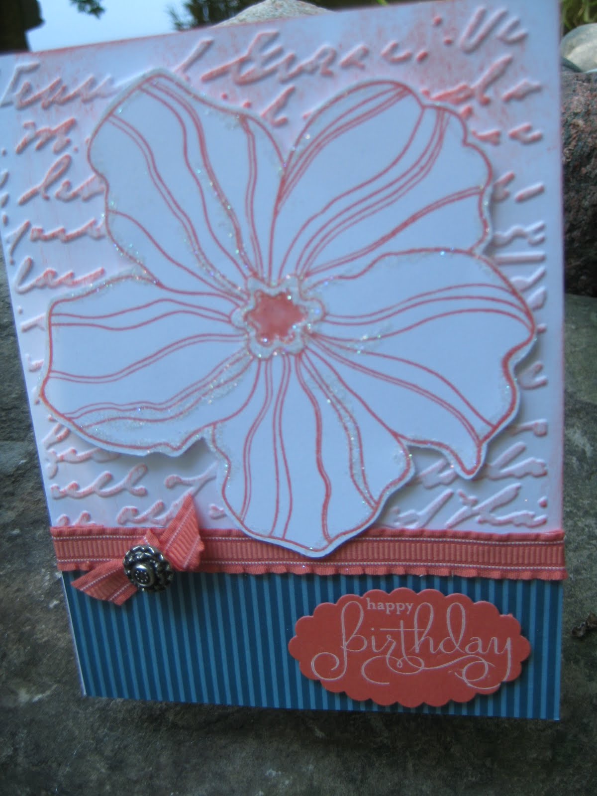
I'm really liking the new Letterpress folder from Stampin' Up that I used for the background, it's a little difficult to see in this picture, but if you click on it to enlarge it's more noticeable. I think it adds so much in a very subtle way. No pun intended, but that is the name of a retired SU set "So Much" I used, love the dotted circle.


Can't believe all the ribbon I've recently purchased and not a sliver of Daffodil Delight among them, have to correct that. So I used a polka dot paper and cut it to resemble ribbon.

I thought the card looked very "girly" and I have some friend's birthday coming up so it will definitely be used soon.

I also noticed another of my favorite blogs, Paper Players, has a sketch that my card fits perfectly, if I do say so myself.

I've been thinking about this design for a while. I purchased a new pair of jeans and the tag was what gave me the inspiration for the ribbon threaded through the circle and I thought it would be a fresh way of using ribbon. (I like the jeans too). Isn't it funny how everything you look at lately takes on a different look? I always think of how I could transform the design into a card. Even my little granddaughter recognizes the new SU colors and will comment on how an article of clothing looks just like Lucky Limeade, Pool Party, etc., she knows all of them. I think there's another little crafter comin' along! By the way, she does have her own blog Arden's Garden of Crafts.


Please let me know your thoughts on this card,
I really do appreciate hearing from you, thanks.


Supplies used all Stampin' Up

Card stock - Concord Crush, Daffodil Delight, Tangerine Tango, Whisper White
Ink - Concord Crush
Stamp set -Happy Greetings and retired So Much
Punch - Bird Builder
Misc. - Letterpress Fancy Fan and Floral Fusion Embosslet die, rhinestones


Sunday, August 7, 2011

SCHOOL DAZE!

Another interesting challenge from Paper Players Challenge, this time a theme.

Well I don't have anyone in my household returning to school, those days are long gone. However, I do have an adorable granddaughter who I will be seeing next week (along with my daughter). As a matter of fact she and I will spend the entire week together at, what she calls "Nana Camp", we even have t-shirts that say "Nana Camp".

Anyhow she will be entering first grade this fall and I know she is very excited to return to school and see all of her friends and teachers, so I'm sure this card will come in handy very soon.

Unfortunately I do not have any stamps pertaining to school or anything even like that so I had to improvise, but then that's what a challenge is all about, I guess.

My card base as you can see is black card stock with a polka-dot layer. Since I didn't have any stamps to use I went to the computer and typed the phrase "*BACK TO SCHOOL* many times, printed it on white card stock and framed it in black. The ABC letters were die cut in red, ran through the Xyron machine to make them sticky and added them to the base layer. I die cut a piece of adhesive cork to which I added 3 little kids (using my Digital software-wow how easy was that) colored them, trimmed them up and added to the cork die piece.
I was thinking it looked a little bare so I added the year with a little star. Who knows maybe this will go in her scrapbook eventually and the date will already be there!

So here's my little treasure...also a peek at the inside (notice I gave myself an A+)


Thanks for checking out my little school kids!

Supplies: Crushed Curry polka-dot paper, black & white card stock
Digital images from School Days Cricut die cut alphabet letters from Plantin SchoolBook
Adhesive corkstock from Canvas Corp.

Die cut cork piece from Papertrey Ink's 2 1/2" circles

Friday, August 5, 2011

PAPER PLAYERS CHALENGE # 57


Hi there, another GREAT challenge from Paper Players, a sketch by Nance Lempinen Leedy (my daughter), yahoo!

Anyhow it was getting close to deadline time again and didn't want to miss this one.

So here is my card, what do you think?

I wanted to use some of SU's newest colors, Calypso Coral, Lucky Limeade and the old standby Whisper white.


The stamps are from Papertrey Ink, Botanical Silhouettes and Peaceful Garden. I really like the blossom stamp it looks so real as if it's gently swaying in the breeze. Also the sentiment "May peace fill your soul this day", it's very adaptable to either a special occasion such as birthday, etc., or a sympathy card, which I've been needing too many of lately. The bottom of the card was die cut using SU's Top Note die, another of my fav's.

Thanks for looking.

Sunday, July 31, 2011

COLOUR Q #9


Oops...missed the deadline for submitting to Color Q for this adorable inspiration color challenge. Isn't this owl the cutest ever! I love it.

Anyhow because I procrastinated so long about how to use the beautiful colors I'm too late, but thought I'd link my card anyhow, so here 'tis using all of the challenge colors.

Thanks for looking.


Supplies used:
PTI's large zig-zag die
Ink: SU Early Espresso
Sentiment: PTI's Half & Half
Silver doo-dads-anonymous

SU piercing tool

Friday, July 29, 2011

CCMC160 - Sketch Challenge


Wow, this challenge from Create with Connie & Mary is right up my alley, my daughter says everything I place is on an angle! And she's right. So here's my creation for this challenge, however there isn't any stamping on this card. I thought the beautiful paper said it all.


Supplies:
Stampin' Up DSP Botanical Gazette
SU Early Espresso Satin Ribbon and rhinestone

PPA104-CAS-Elements of Style-Paper Piercing


Wow what a beautiful inspiration picture from Pals PaperArtists, love the pun too.

I was rummaging through my stash of stuff and discovered a Jewel template from long ago never used, so I thought I'd give it a try using it for paper piercing, not jewels as it was intended.

It really is a simple design, I laid the template on a piece of card stock and pierced the holes in the shape of a flower. I then punched out some petals using SU's Blossom punch (using the smaller of all the petals) and popped them up with dimensionals. Then punched a 3/4" circle of black, then a 1/2" circle of DSP and topped it off with a shiny little embellishment (also from my stash-origin unknown-don't we all have some of this stuff)?
I attached a strip of the DSP topped it with a narrower piece of black and then again (cause I couldn't stop) with another strip of DSP topped with a strip of SU's black Flourish Designer Jewels and stamped the sentiment in black ink for the final touch.

I love the way the light filters through the paper piercing to really show off the design, what do you think?

Supplies: White and black card stock, SU Play Date DSP
Bazzill Basics Flowers & Flourishes Jewel Template
SU black ink and SU Designer Jewels

SU Blossom Punch
Sentiment-SU Well Scripted

Wednesday, July 27, 2011

Yum, Yum-S'mores!

A friend of mine, Diane of Rubber 'n Rafters, and I went on our annual golf outing this past weekend (we're still trying to recoup). Before we went we decided to make and take S'mores for all the gals to eat. Here are a few pictures of the S'mores, needless to say they were a big hit.

Everyone said they're so cute they wanted to take them home to show their kids rather than eat them. Although a few didn't home!make it home!


Aren't they just adorable, we got the idea from Becky Roberts of Inking Idaho who shared a very similar project a while back. Thanks Becky!

Part of what makes them so cute is the new stackable marshmallows, if you haven't discovered them yet, you're gonna want to find some (we finally went online and found them at a local Walmart).

Tuesday, July 26, 2011

PTI-Stamp-a-Faire Challenge #10

I was so sorry to be out of town when Papertrey Ink hosted their Stamp-a-faire event in Ohio...I WOULD HAVE BEEN THERE! Unfortunately the timing didn't allow it, perhaps next time as I'm sure there will be another one.

This card is for the Challenge # 10 which good for me didn't post when it was supposed to which allowed me time to enter, anyhow on to the card...


The challenge was to use layering stamp patterns under a focal point. I used a wood grain background in blue, the same color as the card stock, to imitate the feel for old weathered boards on a barn. I then stamped leaves along the side and upper portion of the card as if the leaves were growing on the side of a barn. My focal point is a shape from Mat Stack #3 again stamped with a leaf pattern. I opted to die cut another circle and pop it up (mainly because I smudged the green ink and didn't want it visible). Stamped the birthday sentiment in blue, added a gorgeous ruffled ribbon down the side with a few graduated sized rhinestones.


Supplies: Card stock-Stampin' Up Bashful Blue
Ribbon-S.U. new 3/8"ruffled ribbon in Lucky Limeade
Inks-S.U. Pear Pizzazz and Bashful Blue
Stamps-PTI's-Through the Trees and Mat Stack 3 collection, Tag-Its #3

Rhinestones- S.U.

Sunday, July 17, 2011

PAPER PLAYERS CHALLENGE # 55

Yikes almost missed the deadline for the PPC #55.

I used the Sanded background stamp in crumb cake ink on card stock of the same color, leaving an opening in the center for my focal image. The image is from Asian Artistry stamped in Basic Gray ink with the bird stamped in Poppy Parade (mainly due to the fact that I don't seem to have any Poppy Parade card stock)! I added a ribbon of Baja Breeze topped with a pearl and three smaller pearls in the opposite corner. The sentiment is stamped in Basic Gray ink.
Thanks for looking.